Case Study · Brand Identity & Systems
A Brand Framework Built for Partners, Residents, and Scale
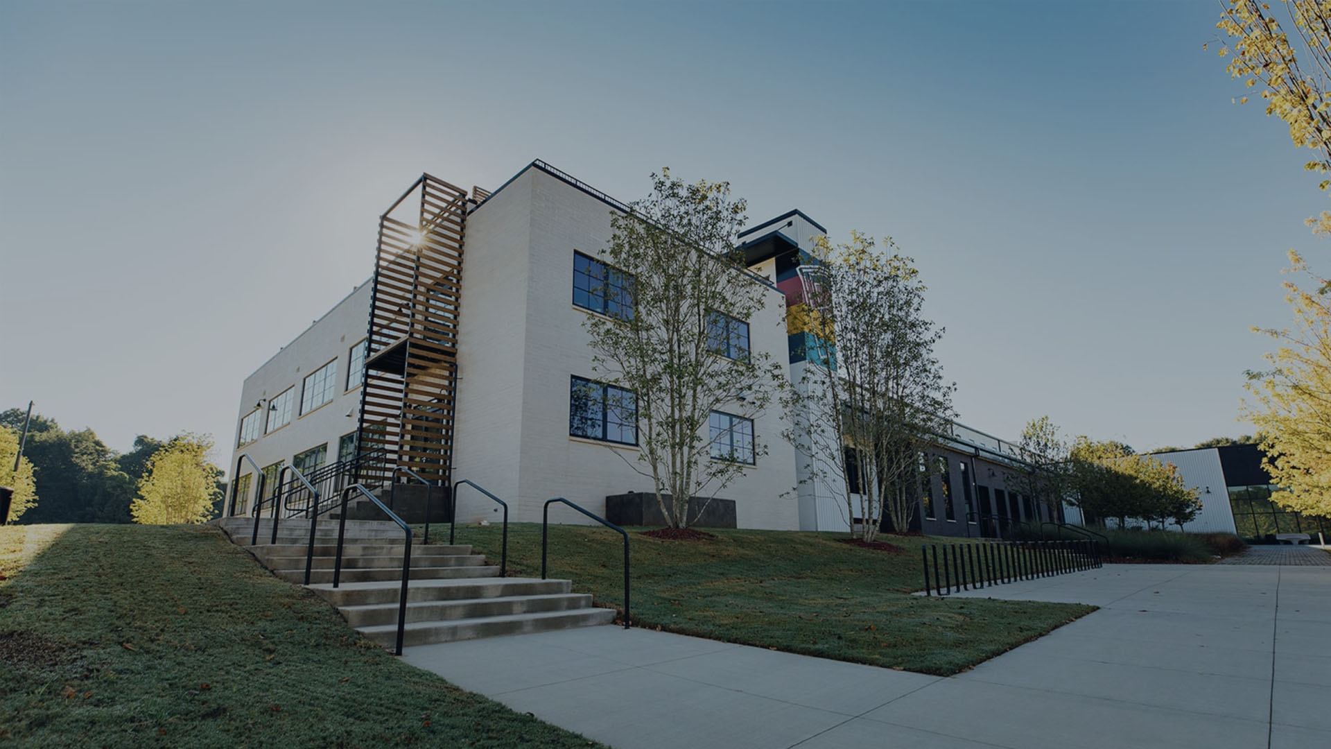
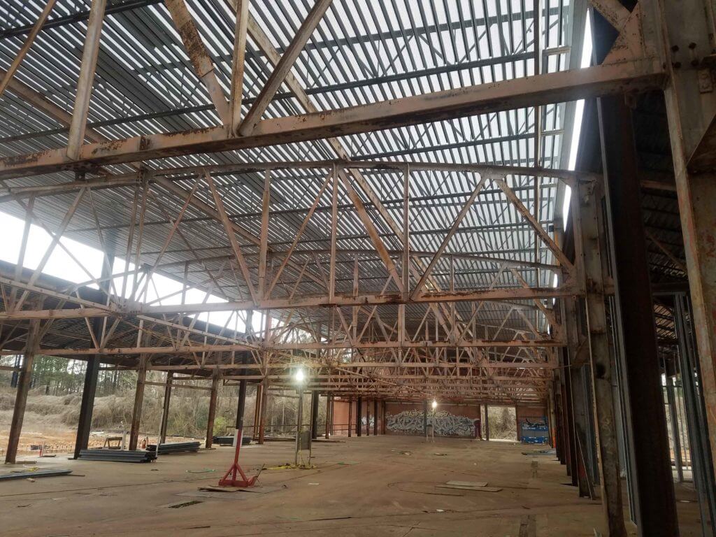
Pittsburgh Yards is a 31-acre mixed-use development in the Pittsburgh neighborhood of Atlanta, built to support entrepreneurship, creative opportunity, and local economic growth. The ambition was clear: create an anchor for a community that had historically been overlooked by investment and urban planning.
What it lacked was a visual language that could carry that ambition. The brand needed to establish credibility with investors and institutional partners while remaining human, local, and genuinely community-first. Doing both at once, and at scale, was the design challenge.
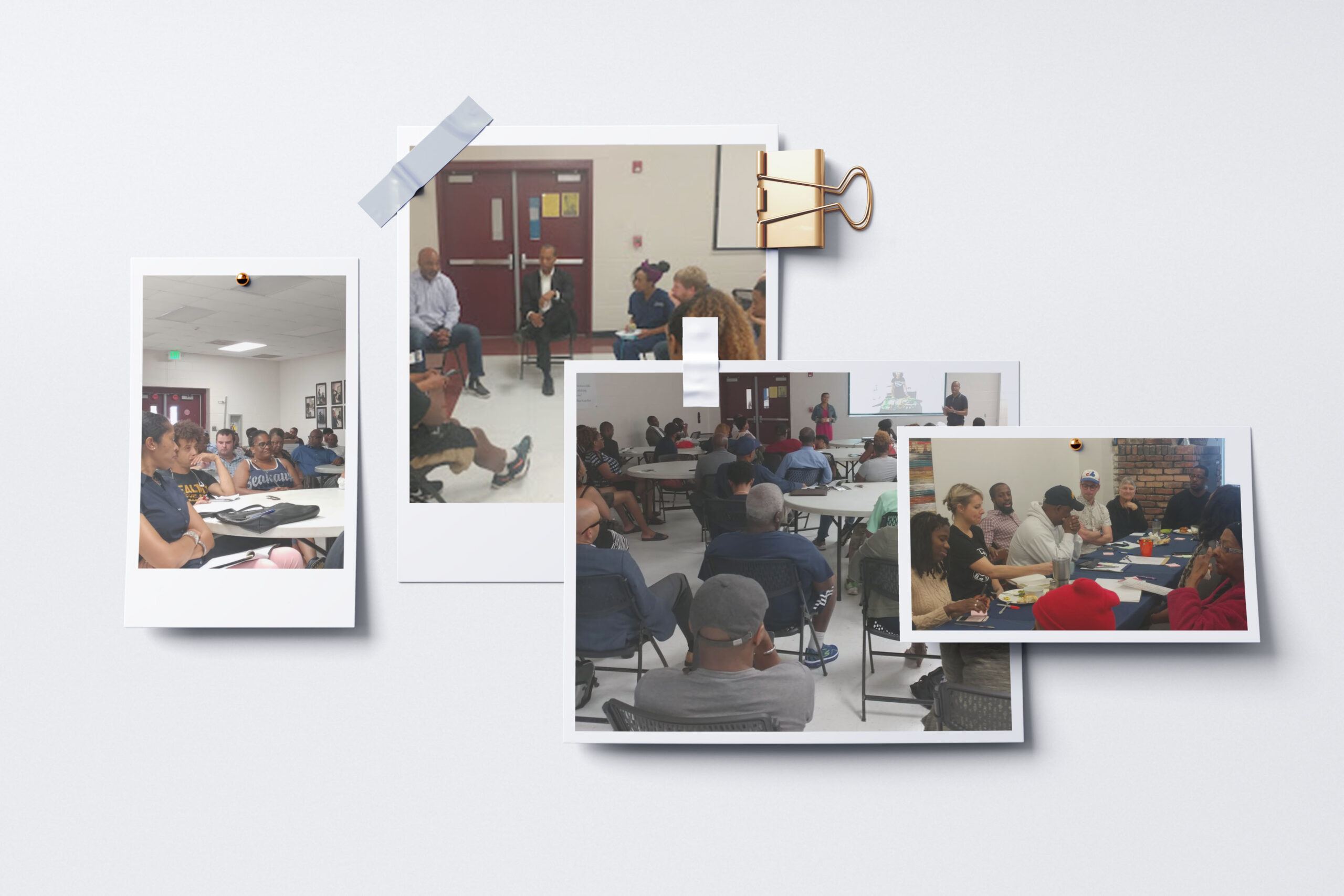
The work began with weekly community meetings, residents, entrepreneurs, and stakeholders in the same room. Not focus groups. Conversations. We surfaced hopes, fears, and identity aspirations before a single mark was sketched.
From those sessions I distilled a strategic brief anchored by four core values: economic mobility, entrepreneurship, cultural affirmation, and equity. Every design decision was pressure-tested against those pillars. If a direction looked polished but felt like it was made for someone else, it was wrong.
Alongside the community work, I collaborated directly with developers and economic planners to ensure brand integrity didn't get eroded by functional requirements, leasing templates, layout specs, programming schedules. The brand had to survive contact with operations.
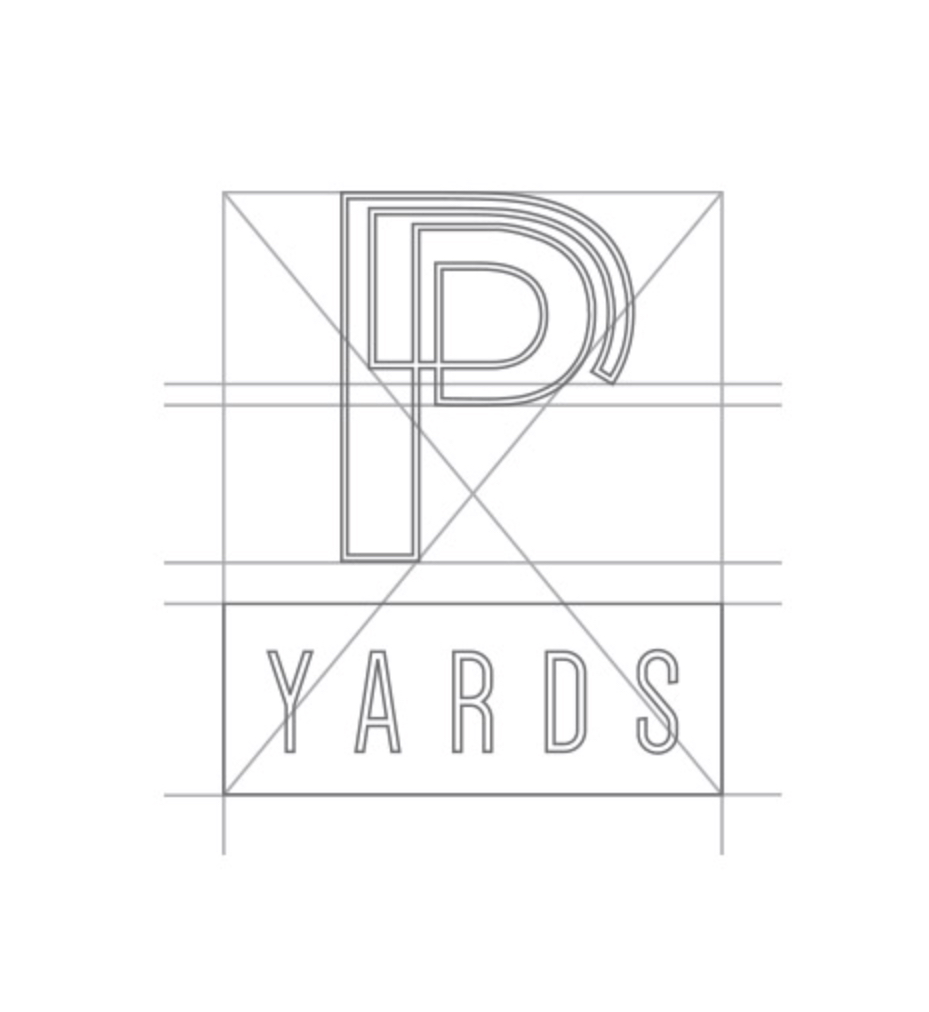
The primary mark is a continuous line forming a stylized "P", a deliberate symbol of connection across people, history, and opportunity. The line doesn't close. It stays open, signaling a community still in motion, still growing.
The mark works at every scale: embossed on signage at the entrance, as a favicon in a browser, as a watermark on a leasing deck. Range of fidelity was a hard requirement, not a bonus.
From website to social to leasing materials, the identity was designed to be immediately recognizable across every screen. Each template was built for a non-designer to use without breaking the system.

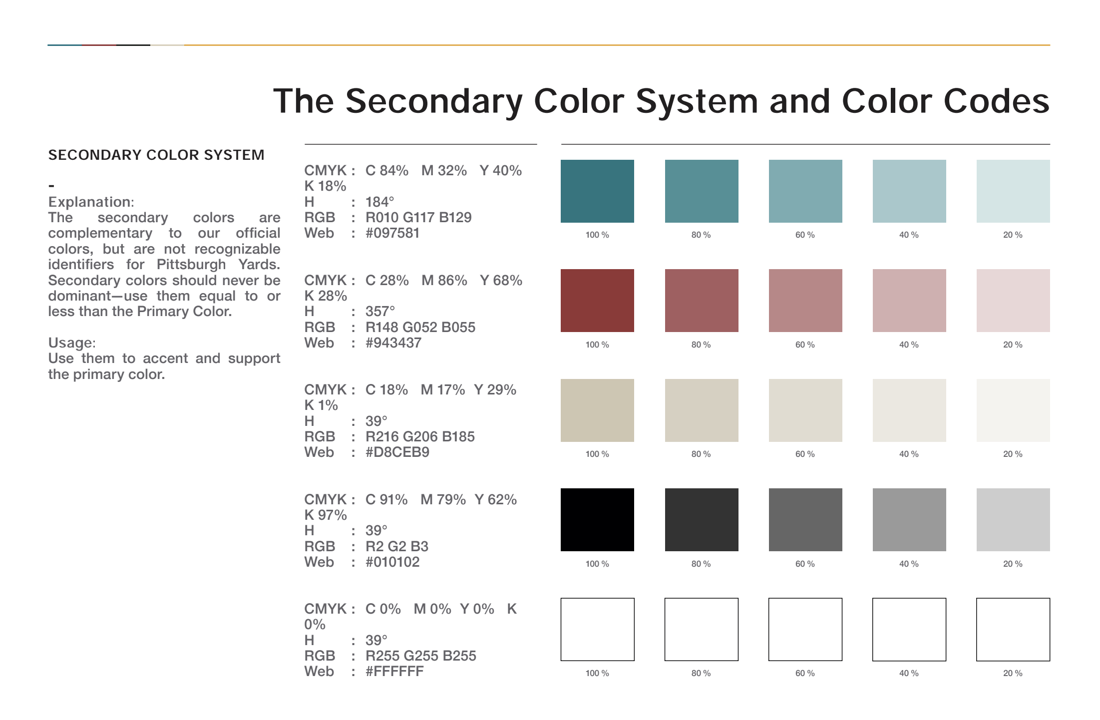
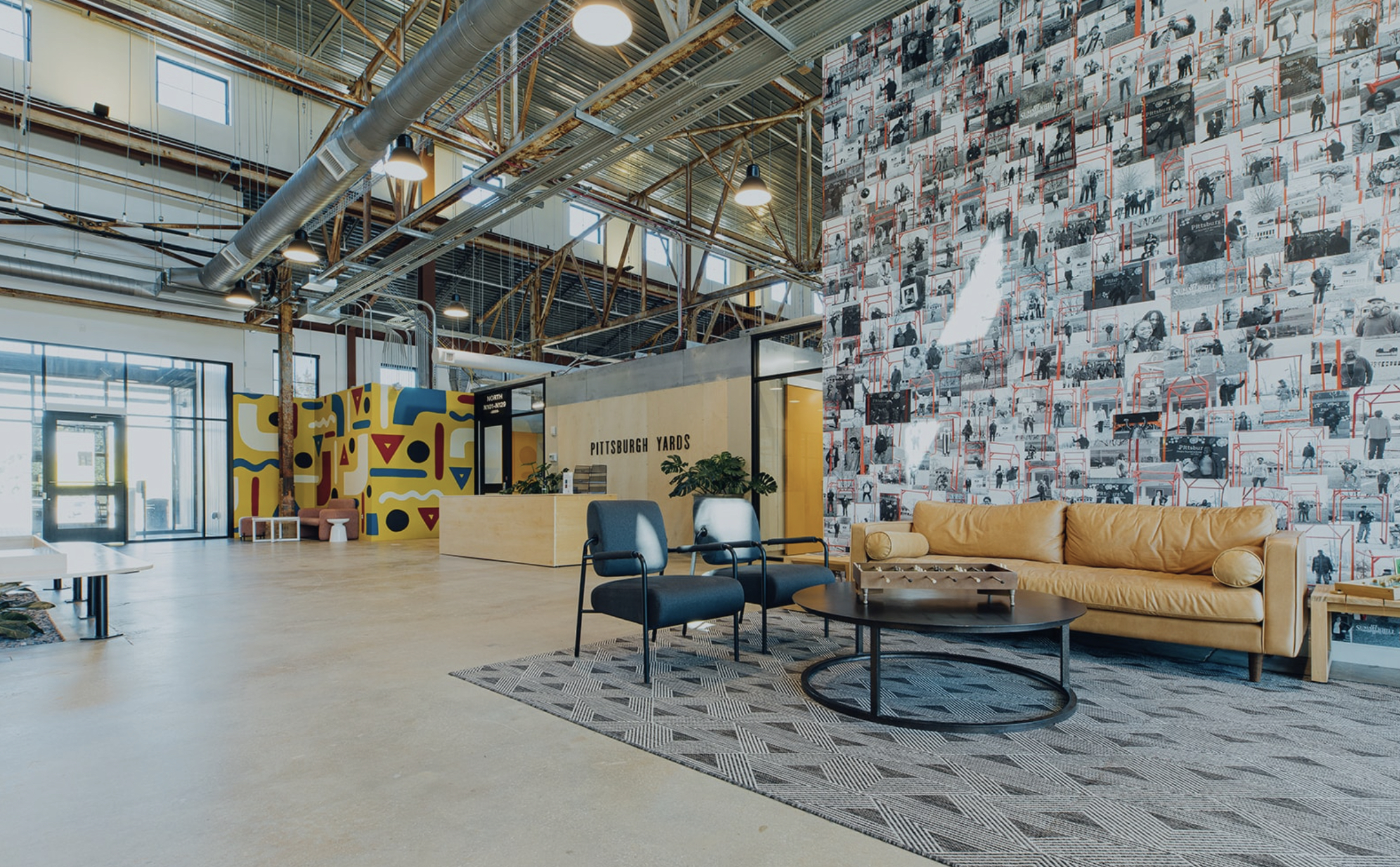
The identity was designed to live in space, not just on screens. Signage, environmental graphics, and wayfinding were developed in parallel with the digital presence, ensuring the brand told the same story whether someone was walking through the Nia Building or reading a grant proposal.
Physical spaces carry weight no digital touchpoint can replicate. For a community-centered development, getting environmental design right was critical to whether residents felt the space was built for them.
The brand system served as connective tissue, linking social purpose, economic strategy, stakeholder coordination, and community identity into a single coherent narrative that investors, residents, and city officials could all see themselves in.